
The following post was written by a guest writer and a true fellow NERRd! Seriously, though, she works at another NERR…
Kim Cressman is the Water Quality Monitoring Coordinator for Grand Bay NERR and a part of the SWMPrats team. She has a master’s degree in marine biology from the University of North Carolina Wilmington, where she studied effects of intertidal oyster reefs on water quality. Throughout her career, Kim has been involved in all aspects of water quality monitoring, from field collection and lab analyses to data management and reporting. At Grand Bay, she oversees day-to-day SWMP data collection and QA/QC, equipment maintenance and troubleshooting, and nutrient analyses. She has experience connecting people to natural resources through volunteer programs, and actively works to synthesize, analyze, and understand monitoring data so it can be applied to real-world situations. She likes graphs, data, and cats. Oh! And pizza pies! Just not pie charts…
Hi, everyone! I’m excited to be here sharing a NERRd-y post about the solar eclipse! One of the (many) things we monitor as part of SWMP is Photosynthetically Active Radiation, aka PAR. This is a measure of light that’s in a particularly useful range of wavelengths for plants and algae; 400-700 nm. Our weather stations report data every 15 minutes, and the data reported for PAR is the total amount of light received by the sensor over each 15 minute period.
There are a lot of patterns we see in PAR and they are related to the movement and position of the earth. There are some typical daily patterns we see in PAR – it’s low in the morning, increases as the sun moves higher in the sky, peaks in early to mid afternoon, and declines until the sun sets. Overnight, the readings flatline at 0.
As an aside, if during our quality checks we notice that the sensor is frequently registering light in the middle of the night, we know we have some sort of sensor problem we need to deal with…
There are also seasonal patterns – in winter, when the days are shorter and the sun is generally lower in the sky, the increase in PAR starts later; the return to 0 happens earlier; and the peak is generally a lower value than we see in summer. On top of that, there are geographic patterns – those of us in the south tend to have longer days and higher PAR values generally than stations way up north.
Here’s a generally normal day at my weather station, as seen through the Centralized Data Management Office’s graphing application :
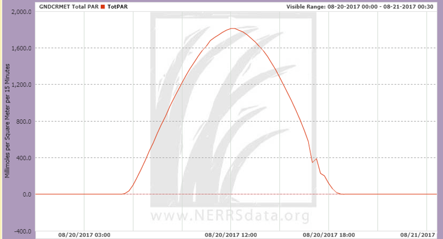
So, if PAR is a measure of light, would we see it decrease during the solar eclipse that happened on Monday, August 21, 2017?
To be honest, I was a little worried. In my neck of the woods (coastal Mississippi), we only got about 80% coverage of the sun. And because maximum coverage only lasted for a couple minutes, I wasn’t sure how our 15-minute data would look. But! The entire event lasted for about 3 hours, and I did see a dip in the data!

It was a cloudy day, which is why the data generally looks kind of jagged. But that big dip just after noon is from the eclipse!
Turns out I wasn’t the only person who was interested in this; other reserves have been posting similar graphs on their Facebook pages. Padilla Bay, in WA, really caught my eye because, on the west coast, the eclipse happened in the morning. That made me wonder: would we be able to “see” the eclipse moving across the country if we stacked all reserves’ data on top of each other? Turns out, you can!
In the following graph, the westernmost weather station is at the top (Kachemak Bay NERR in Alaska), and the easternmost is at the bottom (Jobos Bay NERR in Puerto Rico). The plot contains two days of data – 8/20 so you can see a “normal” day; and 8/21, eclipse day!
I made the graph using R. If you’re interested in the code (would that make you NERRd-ieR?), you can find it here: https://github.com/swmpkim/2017_eclipse_viz
All times have been adjusted to Eastern Standard Time. If you start at the bottom and move up the graph, you can see that daylight starts later at the western reserves than at the eastern ones; at least when everything is adjusted to the same clock time. And when you start at the top and move down the graph, you can see the dip in PAR caused by the eclipse, and how it moved across our stations!
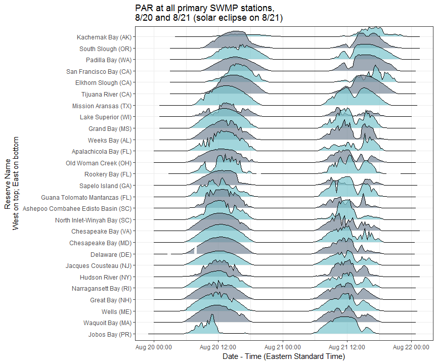
It’s always cool when you can see a unique event in the data you collect, and even cooler when you can compare it to everybody else’s data, too. I hope you enjoyed seeing it as much as I did! Events like these make national long-term monitoring networks (like SWMP) so much more interesting and invaluable!


Very Cool! I was just down the road at the launch watching the eclipse. Glad to see your work paid off.
LikeLiked by 1 person